|
|
A brief description of the National Development Fund’s Logo
- 19 August 2012
- 12:33
- News
- 0 Comment

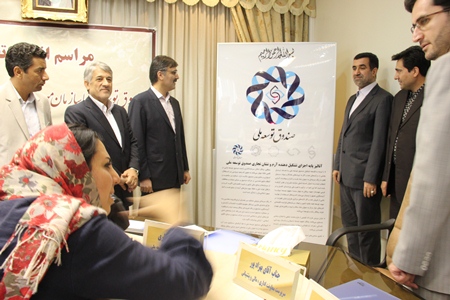
A brief description of the National Development Fund’s Logo
- Regarding the philosophy of the establishment of the fund, aiming at creating long-lasting productive wealth, out of oil and gas revenues, the core dark blue drop in the center stands for oil, gas and gas condensates. The combination of arrows and elements reflect development and a forward-looking approach. Drops and revolving shapes stand for coin and wealth and arrows for growth and advancement.
- The outer component, a curved octagon, represents balanced, sustainable development, dynamism, growth and prosperity of productive capital.
- Combination of Eslimi curves indicates the possibility of making investments all across the globe, the external parts reflect independence, stability and comprehensiveness of the fund.
Protecting the assets and saving the share of future generations of oil and gas resources are emphasized as well.
- The outer dark blue color indicates added value of oil products as well as forward looking approach and credibility, while the sky blue color represents panorama vision and transparency in the fund’s performance. The combination of colors emphasizes on the Iranian, Islamic models for progress.
- The calligraphy is a noble Iranian element of the logo, which reflects the position of the National Development Fund.
Rate :
Post a Comment